Welcome
Monday, July 28, 2014
Pocket page The Sky is the Limit
I really wanted to try a pocket page using PPbN files so this is what I cam up with. I is pretty simple but I think I like it that way. the file is The Sky is the Limit. I just shrunk the title way down but it still cut just fine.
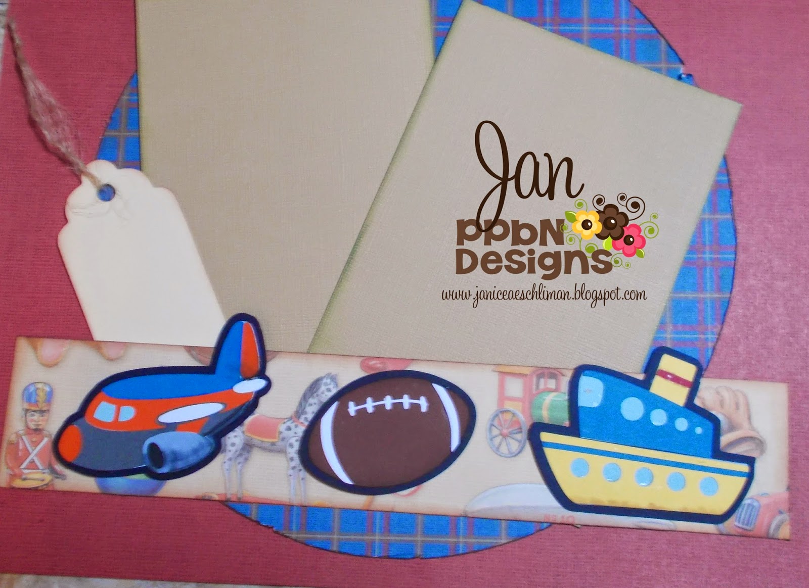
Boys and Their Toys file from PPbN
This layout will be perfect for my grandson. I will be visiting him some this summer so I can get the perfect shots to go with this. I used paper from K & Company, chalk inks from Quick Quotes, Scotch Quick Dry Adhesive and the files from PPbN Designs. The file was Boys and their Toys but I just used the title and the toys. I did make a black layer because my toys were not showing up on my border. I did this by putting the pieces of the file together on the DE mat and then I did a .100 offset. Hope you enjoy my layout and your day. Thank you for visiting my blog. Below is the link for the PPbN Memberhip where Nikki is giving away a new ipad to one of the members.
|
Monday, July 21, 2014
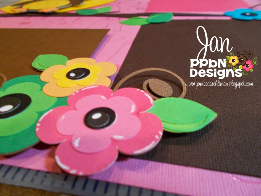
You're A Hoot PPbN Designs file
Hello everyone! I decided to show you how I plan a layout and sometimes decide to change things. I always take a picture before I glue down my pieces to see if I like how I have things laid out.
I decided I needed a moon behind the owl so I went into my Silhouette Design Studio and I just made a circle and pulled it off the page a little bit and cut.
I put pop dots behind the owl and some of the flowers to give added dimension to my page.
I added some accents to my words and some of the flowers to make them pop a little.
You can find the file You're a Hoot here
Materials used:
You're a Hoot file
2 base papers
2 pinks
3 browns
2 yellow/orange
1 turquoise
3 greens
Scotch tape runner
Scotch Quick-Dry Adhesive
pop dots
White Signo pen
|
Monday, July 14, 2014
Zoo layout
Our zoo is on a mountain side and the view is so gorgeous but today I am only going to show you the giraffe enclosure. This is so different because we fed the giraffes lettuce and you could pet them, take your picture with them and even have them lick you. For this layout I used the Through Thick and thin file. I inked my edges with powder puff chalking ink.
For the eyes I used a uni ball Signo white pen for the white areas, the blue accent is a colored pencil. For the lashes I used a black colored pencil to draw a black line around part of the eye and smudged it with a paper nib and odorless mineral spirits (both can be found at Michael's) and the the lashes are drawn on with a .05 black marker.( I use Prismcolor brand).
This title was made using fonts from my computer and a mountain from the Silhouette store.
|
Monday, July 7, 2014
The Doc Is In form PPbN Designs
Good morning this is my Monday post for ppbndesigns.com. The file can be found here. The white flower border can be found in the Silhouette Store. I had to size and weld the border but all the rest of the pieces are cut at the size they appeared on the mat. This layout worked great for my grand daughter's visit to the doctor.
I used my Silhouette
2 sheets pink gingham paper
1 pink striped
1 reverse of the first gingham paper
1 sheet white paper
2 different purple
2 different pink
1 tan
1 turquoise
1 light brown
1 darker brown
Scotch glue
Scotch tape runner
1 ready made tag with reg and pink twine.
|
Subscribe to:
Comments (Atom)


